
By Jason Krieger, Product Designer
With the first Design post on our new Product and Engineering-focused blog, we wanted to share a quick overview of our new design system at Yieldstreet. Let’s rewind a bit: In the second half of last year, our team made the transition to Figma for our design tool (more on that in a future post). With it came the ability to have a centralized design library that everyone on the team could work with. We were able to utilize this functionality with our recent brand refresh (another future post as well).
To start wrapping our heads around a shared system, our team of six designers took to the whiteboard to map out the hierarchy of how we would lay the system out, along with our file structure.
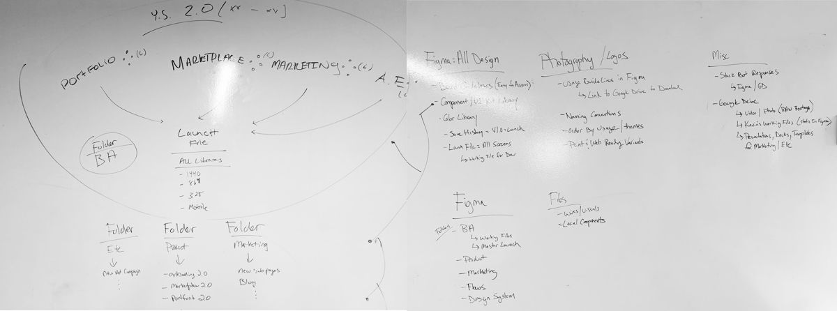
Since our Design team is more than just Product design work, we not only mapped out what would live within Figma but also elsewhere for the rest of the company to access. Anything that couldn’t fit within Figma (photo & video libraries, shared resources, deck templates etc) would live in Google Drive.
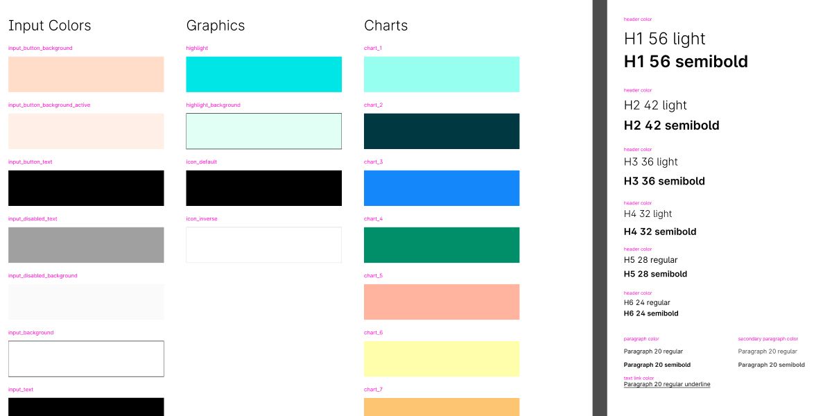
At the top level, we have our core UI Kit. This file is home to our brand colors, typestack, page components, iconography and more—items that would be used across the board for all design work.
Under that, we broke our into sub-libraries:
- Colors: We were able to break out our colors into different categories based on usage: Brand, Input, Text, UI, Charts & Graphs
- Product Components: With our design team spread out among different pods, some components only made sense for certain areas of the product. A chart design, for example, may only ever appear on the Portfolio and would live in the Portfolio Library
- UX Kit: Building out a shared library of components to be used when wireframing and creating flow charts. This would help us establish a consistent look when presenting and sharing our work even when not in hi-fi visuals
- Marketing Library: Later in 2020, we created a new component library for all marketing/landing pages to have shared component structure.
But just because a component lived in a sub-library didn’t mean it had to stay there forever. If we found a shared use, we could graduate that component to the global UI Kit.
One side benefit we found when breaking out our colors into sub-libraries was when selecting colors in Figma—having them broken out by category helped us tell the difference between a black used for an icon and a black used for text.
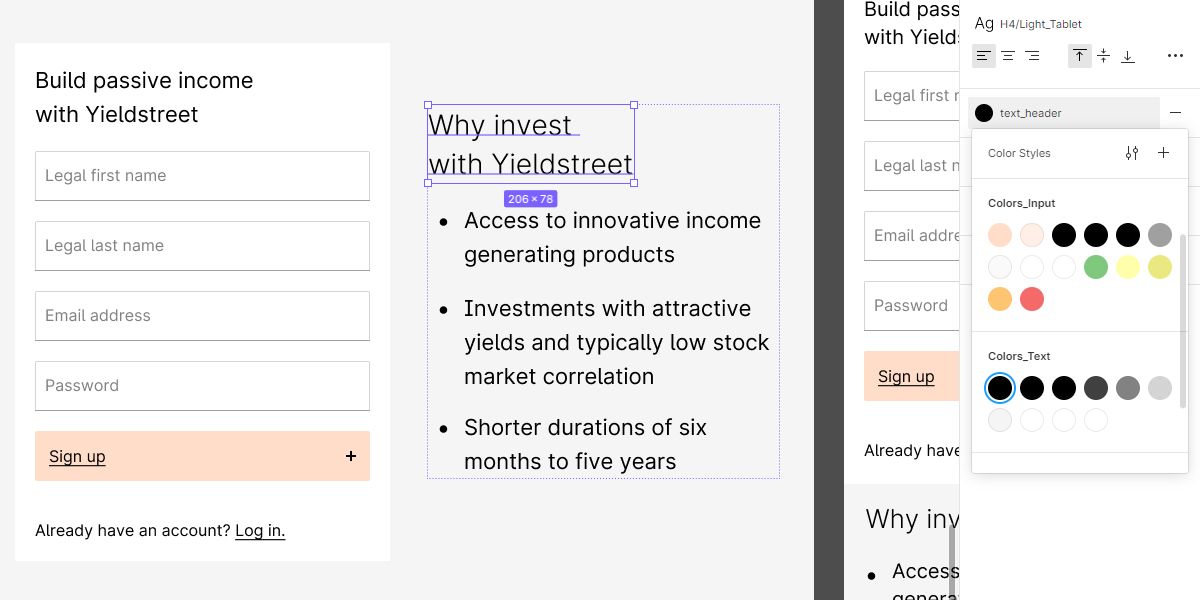
Another pro-tip for Figma users: Add the hex value to the color description. On hover you can see the value more easily.
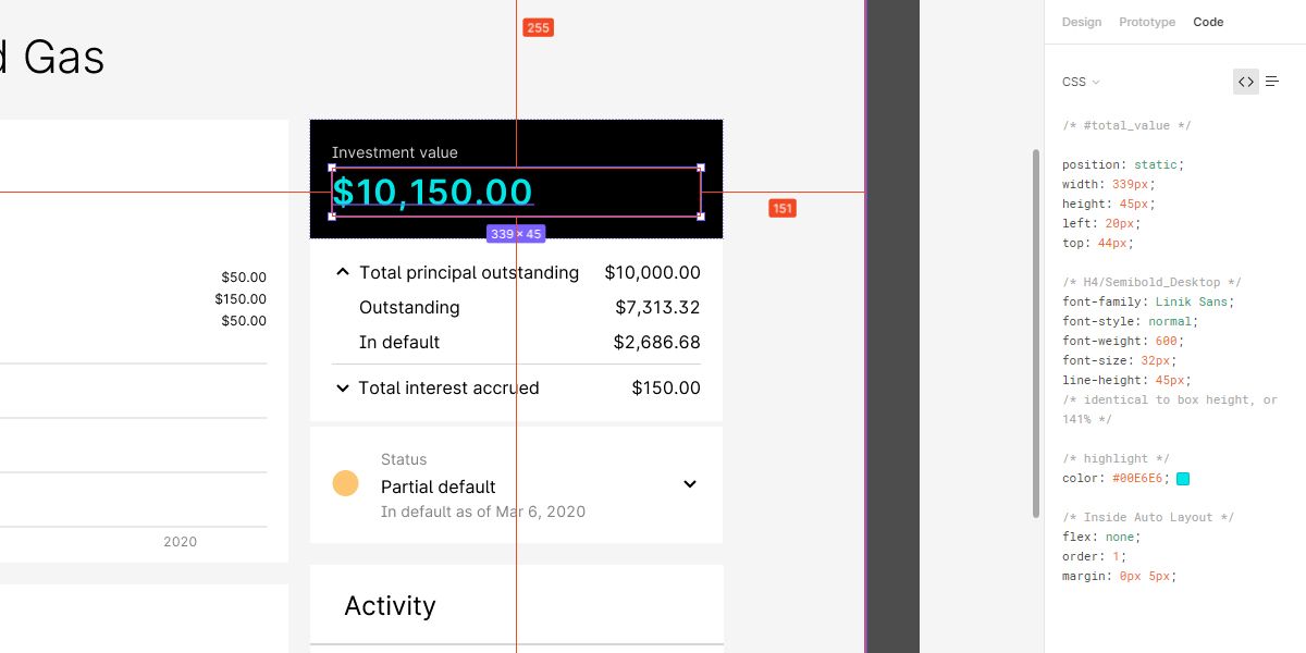
Once the core of these libraries and components were built out, we then aligned them with our front-end engineering team. Not only did we focus on building out similar components (form fields, buttons, etc.) but we wanted our naming convention to match as well, aligning the variable naming for colors and typography to match across both systems. When our engineers take a look at the code view for one of our design files, they’re able to easily see the same variables that match their systems.
Since the launch of our rebranding earlier in 2020, we’ve continued to evolve our system—adding/removing components, updating current ones, and continuing to align with our engineering team on what components still need to be made. The design team meets twice a month to look over any changes we want to make or components we want to add to the global library to make sure we’re aligned and to be aware of how our working files may be affected.
We hope you found this brief insight into our young system helpful for building out your own. There is no one-size-fits-all approach with team sizes and product offerings differing so wildly from one company to the next. Half the fun is finding out how to build one that can help your team work faster and bring a more consistent look to your product and brand. As mentioned earlier, we’ll be sharing more insights into how we use this system and how we use Figma in upcoming posts, so be sure to check back.


